Declaring Goods and Services Experience
Singapore Customs
COMPANY
Singapore Customs
ROLE
UI/UX Design, User Research, Branding
Industry
Trade & Revenue
YEAR
2019
Context
The Singapore Customs app and web portal enable travellers to declare and pay duty/GST on goods before arriving in Singapore. The SG Customs team wanted to redesign the experience to improve the usability and drive adoption of their self-service digital channels, which were previously under-utilised due to confusing interfaces and low user confidence.
Challenge
Many travellers struggled with the customs declaration process due to:
Confusing layout and unclear entry points
Poor mobile responsiveness and cluttered layout
High cognitive load when calculating duty/GST payable
Last-minute declarations at checkpoints, creating bottlenecks
Business Priorities
The priorities were to improve operational efficiency, reduce manual intervention, and drive digital adoption by making the declaration process faster, clearer, and more accurate.
Outcome
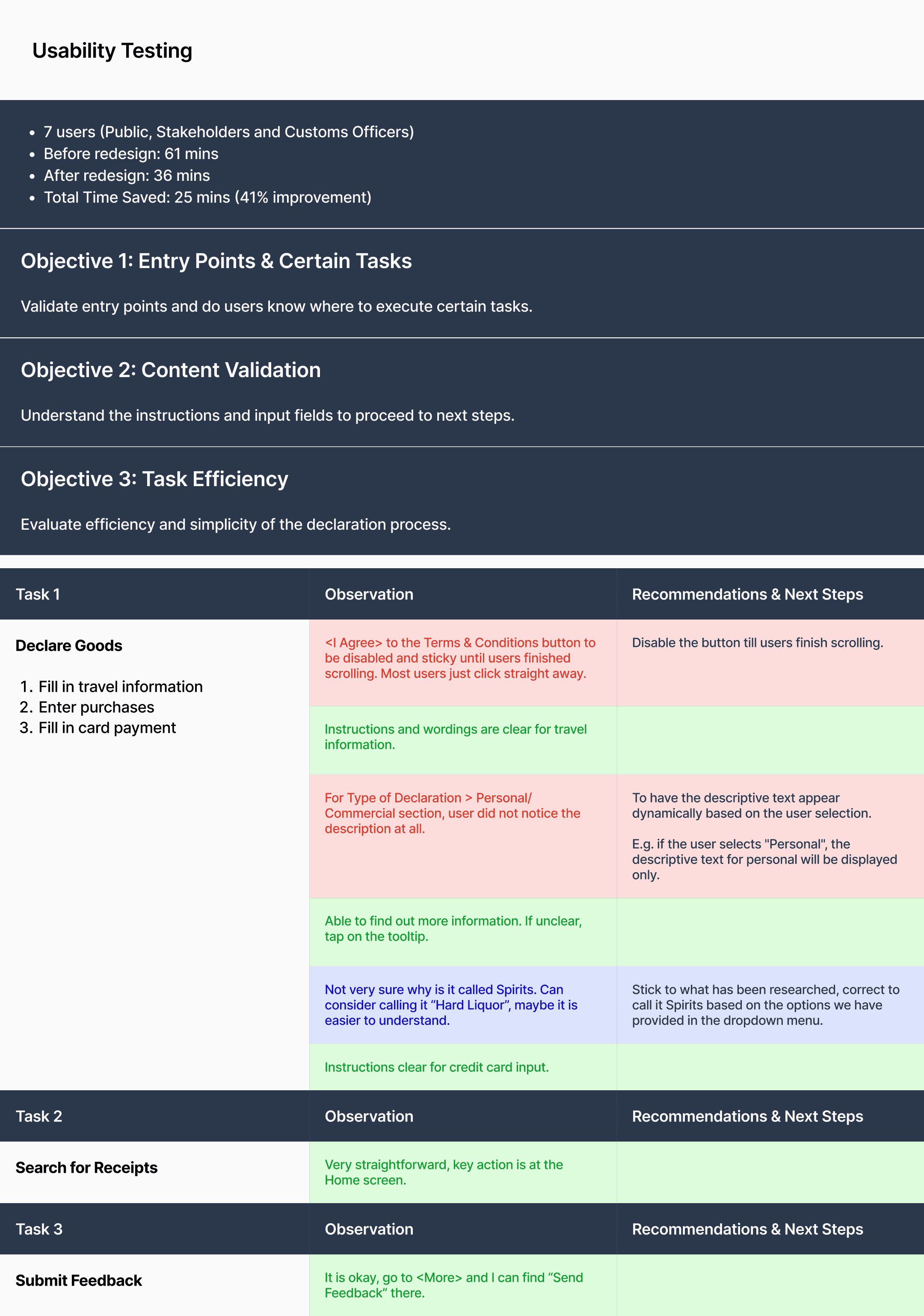
The redesign reduced average task time by over 40%, improving speed, usability, and user confidence. This also eased operational load for customs officers. All users completed their tasks successfully, with positive feedback from both stakeholders and officers on the clarity and overall experience.
Timeframe
2 months
Target audience
Members of the public & Singapore Customs officers
Role and Collaboration
I co-led the design alongside my teammate, Thiam Yong, working closely with the Singapore Customs team through on-site collaboration to deliver both the mobile app and web portal.
Research and Planning
We began by analysing the current platform and addressing issues raised by stakeholders.
Platform Audit: We conducted a heuristic review of the existing web interface to identify usability gaps, inefficiencies, and outdated patterns that hindered task completion.
Stakeholder Alignment: Early sessions with SG Custom team helped highlight operational constraints (gaps in validation needs, especially for customs officers) and business priorities, shaping our design scope.
User Interviews: We interviewed both public users and customs officers, uncovering key pain points such as confusing UI, lack of guidance, and friction during mobile use.

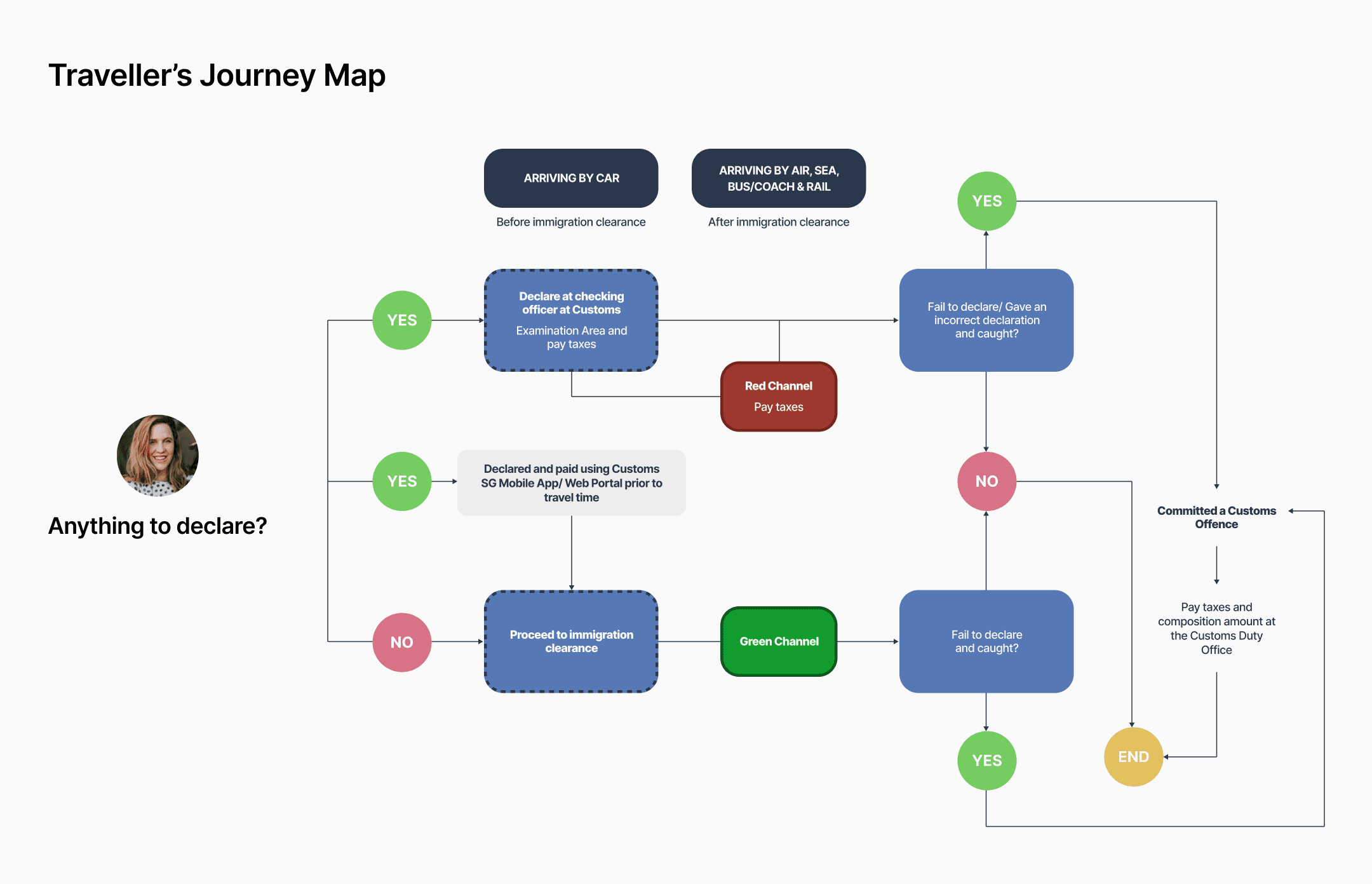
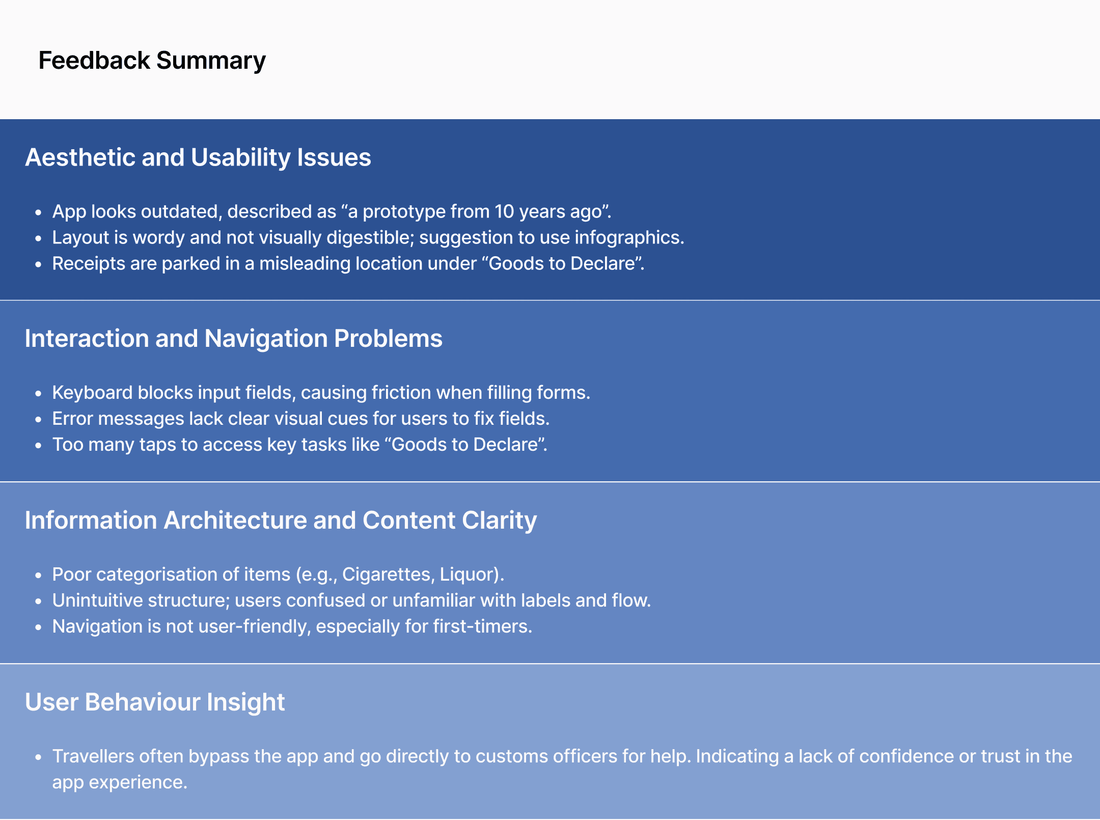
Insight
Users perceive the app as outdated and confusing, leading to frustration and avoidance. Core journeys like declarations are buried behind unclear labels and too many taps, ultimately driving users to seek help from customs officers instead of self-serving.
• • •
How might we simplify the declaration process and make key actions more intuitive and trustworthy, so that travellers feel confident completing it independently?
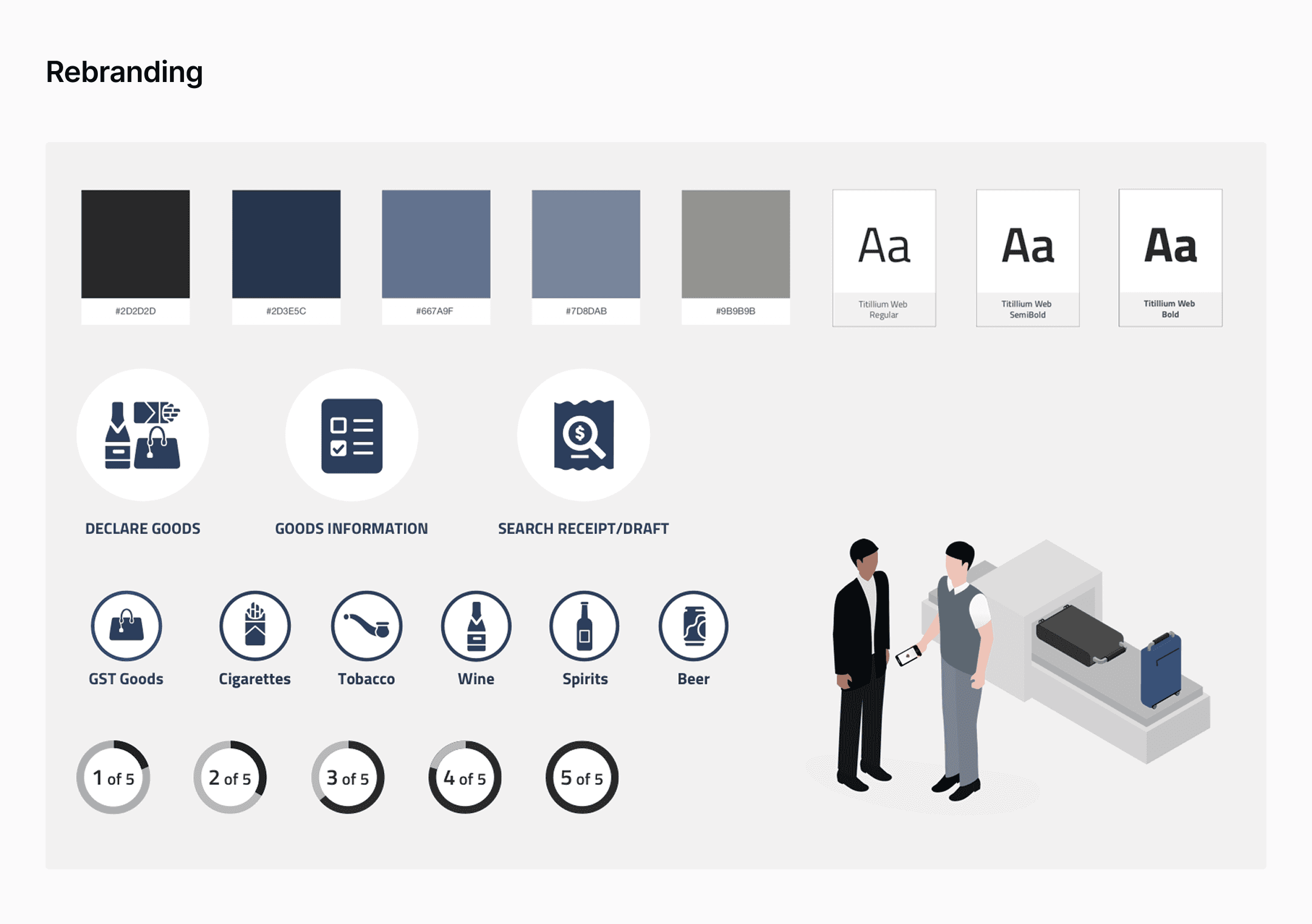
Visual Strategy & Wireframing
We started by refining the visual identity of SG Customs, modernising the interface while working closely with the existing colour palette. A clean, functional style guide was established to align stakeholders and streamline UI development across mobile and web.
Using insights from early user interviews, we restructured the information architecture and simplified key flows. Weekly check-ins with stakeholders enabled rapid feedback loops, allowing us to refine wireframes and prototypes iteratively.
We built and tested interactive prototypes that focused on clarity, task efficiency, and accessibility. Continuous collaboration with developers ensured design intent was preserved during implementation.

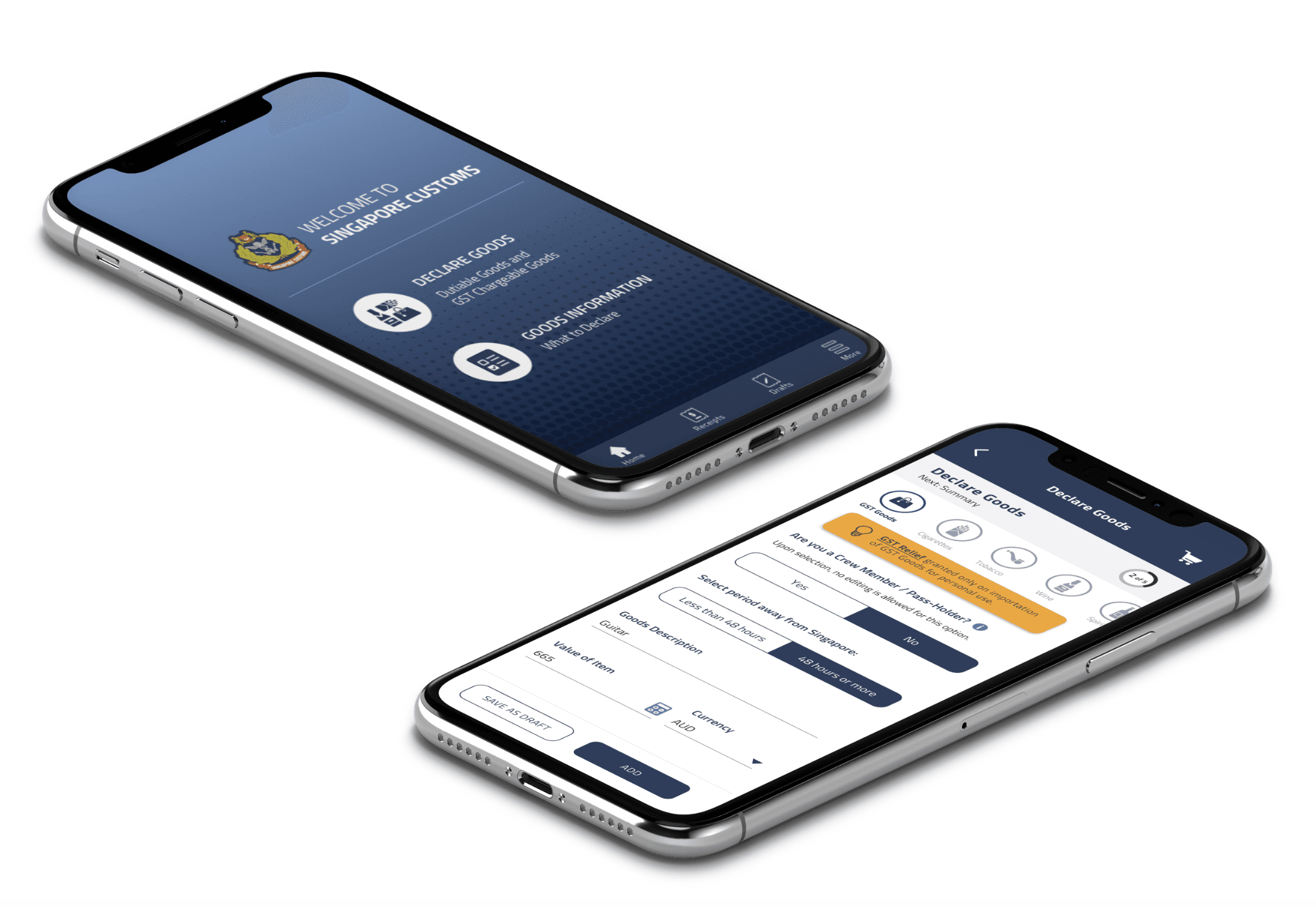
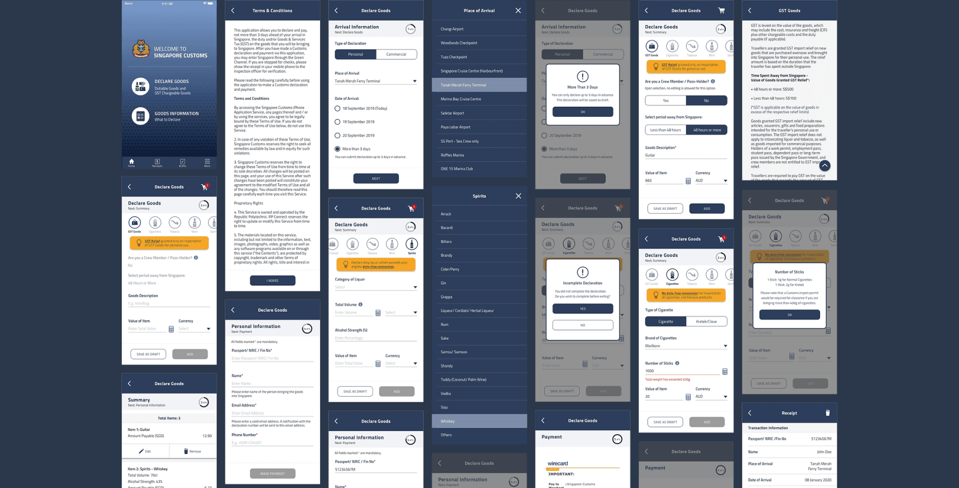
Design Solution
The final solution addressed the needs of both personal, cabin crew and commercial users, improving usability across multiple declaration types.
We redesigned the experience with guided onboarding, a clear stepper, and intuitive navigation.
Usability was enhanced through restructured categories, icons, info-tips, and micro-interactions that nudged users through key actions like checkout and payment. The interface used minimal, accessible visual elements aligned with the brand for clarity and ease of use.
View website here.


Final Thoughts
Many repeated users had unknowingly adapted to the app’s poor UX, relying on inefficient habits to complete tasks. But familiarity doesn't justify friction.
The redesign not only made the process faster and clearer, it also transformed a previously frustrating experience into one that feels intuitive, efficient, and user-friendly.
Even routine government services can be designed to feel seamless, empowering, and human. I believe the outcomes also reflect the core principles of Singapore's Digital Government Blueprint; delivering user-centric services and improving operation efficiency.