Why Solana’s UX sets the standard for DeFi: A product designer’s take
8 min read

When I first got into crypto, I wasn’t sure what to read or who to follow to learn more about designing for the space, without blindly following trends or influencers, of course. A friend kept shilling Solana at one point, so I started looking into it. Once I started exploring the ecosystem, I realised how much good design was actually happening in the space.
Most people in crypto rave about Solana’s low fees and blazing-fast speed. But as a creative, what really caught my attention wasn’t just the tech, it was the user experience.
The more time I spent trying different wallets, the more I noticed that Solana’s ecosystem felt different. It wasn’t just fast and cheap. It actually felt easy to use.
A quick scroll through Reddit shows I’m not the only one who feels this way. Many users find Solana’s UX smoother, faster, and more beginner-friendly than Ethereum, from gas fees to how easy it is to use dApps.

We often hear that DeFi is “too complicated” for mainstream adoption. And in many cases, that’s true. But Solana is quietly rewriting that narrative not just through performance, but by cultivating a user-first ecosystem that makes DeFi feel intuitive, accessible, and even delightful.
In this article, I’ll share why Solana’s user experience stands out and spotlight a few dApps that, in my view, do a great job with crypto usability. I won’t be covering technical aspects like scalability, speed, or low fees. This is all about UX and design patterns.
If you are interested in reading more about Solana's blockchain as a beginner, this article might help: Welcome to Solana, Your Beginner's Guide to Exploring the Blockchain
The secret behind Solana’s mass adoption: UX, not just transaction per second 🤡
It’s easy to attribute Solana’s adoption to low transaction costs and fast speed. But there’s something deeper happening here.
Solana’s ecosystem has evolved with a mobile-first, design-conscious mindset. It’s not just for traders or techies. It’s for creators, NFT collectors, and everyday users who expect seamless digital experiences.
Here’s what I believe they’ve done right:
Mainstream crypto wallets like Phantom feel as polished as Apple Pay.
Ecosystem-wide design consistency makes switching between dApps feel natural.
Intent-based UX, like in Jupiter, abstracts away complexity without dumbing things down.
This is a chain that understands UX is a growth strategy.
5 Solana dApps that nail UX and what we can learn
Phantom wallet
The “MetaMask of Solana,” but better.
What works: Fast setup, clean portfolio views, in-wallet staking, NFT support, and smooth interactions.
What to learn: Integrating multiple use cases (DeFi, NFTs, swaps) doesn’t have to clutter the experience if the design is modular and intuitive.
UX tip: Phantom uses progressive disclosure. You see only what you need, when you need it.


Jupiter aggregator
A DEX aggregator that works flawlessly with Phantom, Backpack, and other Solana wallets.
What works: Transparent swap paths, live pricing, simple UI with advanced options hidden by default.
What to learn: Users don’t need to understand liquidity routing, they just need to trust it works.
UX tip: Jupiter’s clean visual hierarchy makes even complex swaps feel straightforward.

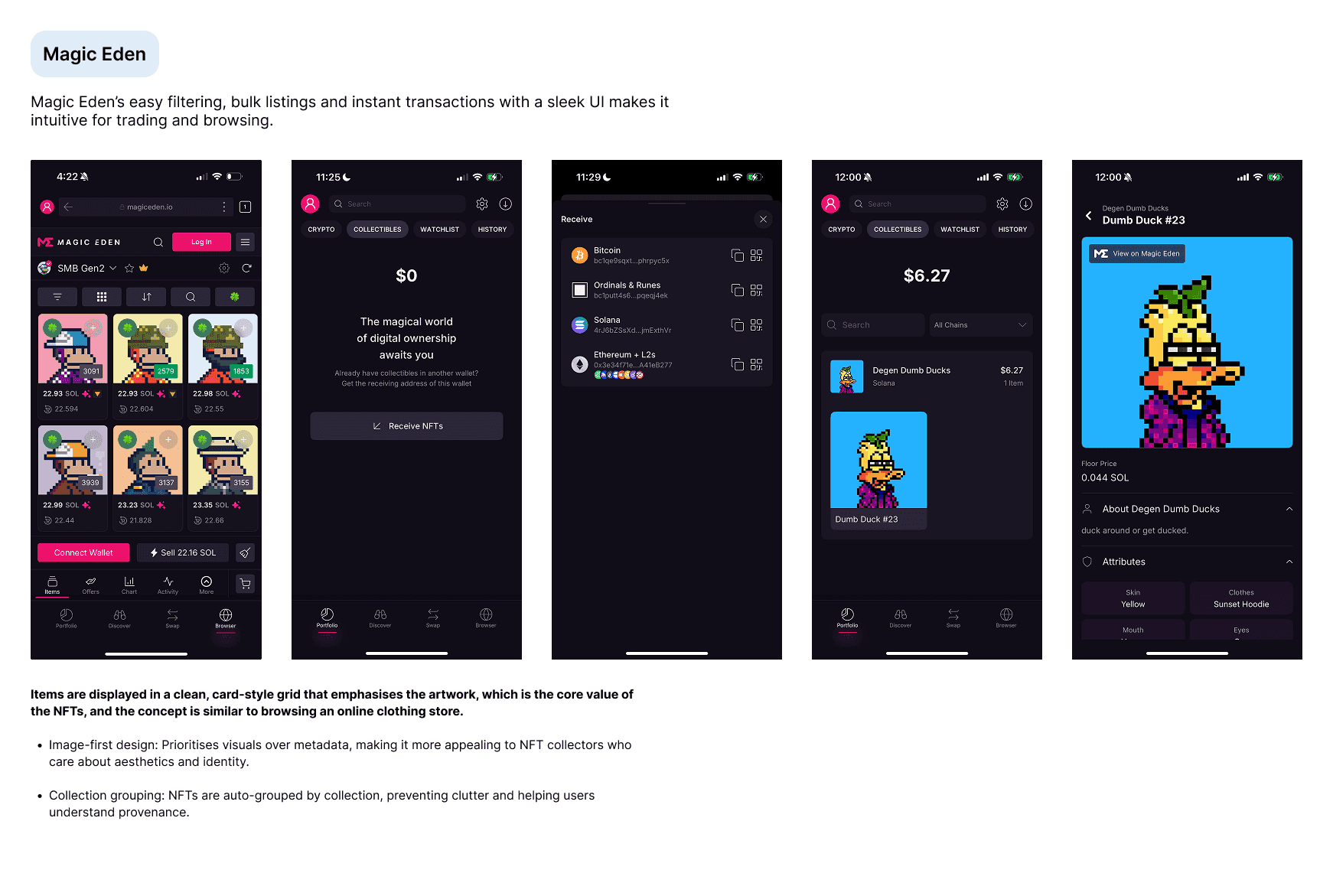
Magic Eden
The NFT marketplace that helped put Solana NFTs on the map.
What works: Clear collection layouts, optimised flows, instant listing/buying, helpful filters.
What to learn: Browsing NFTs should feel like shopping.
UX tip: Treat visual content (like NFTs) as the hero, not the blockchain data.
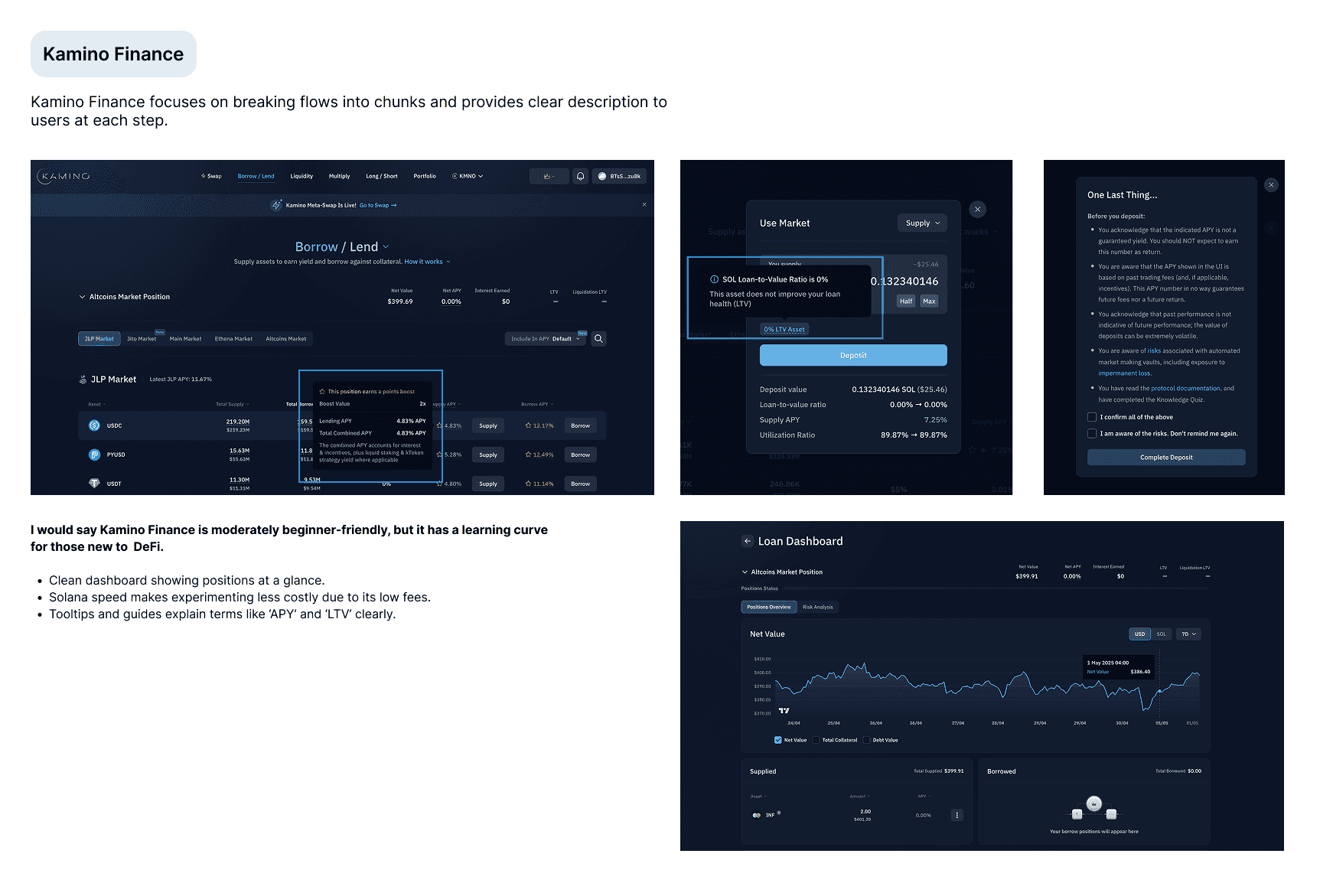
Kamino finance
A user-friendly platform that helps you earn with DeFi strategies, without the complexity.
What works: Kamino makes complex DeFi actions like lending or yield farming easy to follow with a clear, step-by-step flow. The vaults show clean stats, simple explanations, and give users a sense of safety with clear confirmations and risk indicators.
What to learn: Makes advanced DeFi accessible if you focus on breaking flows into chunks and giving users clear feedback at each step.
UX tip: Kamino does a great job of explaining APYs, utilisation, and risks with inline help and visual cues. Great for new users learning the ropes.
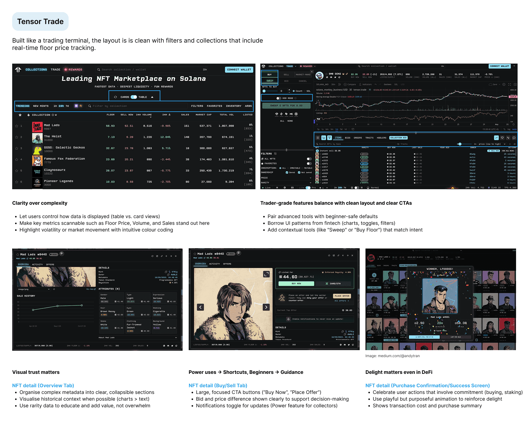
Tensor
A fast, easy-to-use NFT marketplace designed for both new and experienced traders. While I haven’t used Tensor before, trying out its trading terminal felt surprisingly refreshing. The gamified copywriting and nostalgic pixel art style give it the charm of early computer and video game graphics.
What works: Tensor is built like a trader’s terminal and still doesn’t feel overwhelming. The layout is clear and clean in hierarchy, the filters and collections load near-instantly, and it includes real-time floor price tracking with a slick, minimal UI.
What to learn: Even with a “pro” vibe, it’s possible to maintain a fast, focused interface by emphasising data clarity.
UX tip: The grid and list view options, easy bulk actions, and no-gas listings make Tensor great for advanced users while still being easy enough for beginners.
Patterns designers should learn from Solana
Across these dApps, a few design principles stand out:
Progressive onboarding: Wallets and apps ease you in, step by step.
Single-action screens: Minimise choices, maximise clarity.
Consistent wallet UX: Top-right placement, truncated address, dropdown actions to let users always know where to go.
Trust through simplicity: Clear CTAs, helpful tooltips, and friendly microcopy build confidence.
Final thoughts
One thing to note after exploring Solana's top dApps: Great DeFi UX isn’t about hiding complexity, instead it is all about about guiding users through it~
If we want crypto to reach more people, we have to meet them where they are. That means designing for clarity, safety, and joy, even in high-stakes, high-speed environments. Solana is doing this right, and there’s a lot the rest of Web3 can learn from it.
Whether we are designing for the next staking interface or rethinking wallet UX, it's worth remembering that the best tools don’t just work, they feel good to use.
I'm still learning and improving as I explore this space, but diving into Solana's ecosystem has been a great reminder of how powerful good design can be.
P.S, not shilling SOL.